In my last article, I discussed how to get started with HTML for noobs!
As promised I will now deliver an article on different website themes and trending theme for the past few months.
When you visit you favorite websites you may notice that the site has a ton of content, images, videos, and graphics. Perhaps you ask yourself how on Earth does one design a spot for all of these elements? How do you decided where certain elements go and where they shouldn’t go.
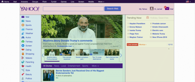
Well my friends, that depends on the type of website you are viewing. If you are looking at Yahoo.com, you will see an entirely different layout than the one for say Bungie.net
Yahoo is a website that will display the most recent or trending news topics and Bungie is a company that creates games so their content will be based on their games. Yahoo will of course have more content because it will cover news from all corners of the globe whereas Bungie will only cover news of what goes on within its own company.
You may also notice the color schemes are different. For Yahoo there is a lot of bright colors and for Bungie there is a lot of dark colors, almost polar opposites right?
Yahoo’s theme is built so that a user will see the important and trendy news stories before moving onto something else. Bungie’s website is built to showcase a recent upgrade to on of its products. Its goal to make a user want to know more about the product. Some themes will be structured to show multiple sources of information while others may only be structured for a few. You may have noticed that some websites will display nearly full screen images with perhaps a header and a brief description of what the image is about.
The theme we will be focusing on in my video series will be structured to show information and then move forward to full screen themes (the fun stuff). So please stay tuned.